THE PURPOSE
Mingle is a cocktail bar where people come together to enjoy expert mixology. It’s modern, trendy and stylish, the perfect venue to have a great time with friends.
Based on this brief, the task was to design both a brand identity and menu cards for Mingle.
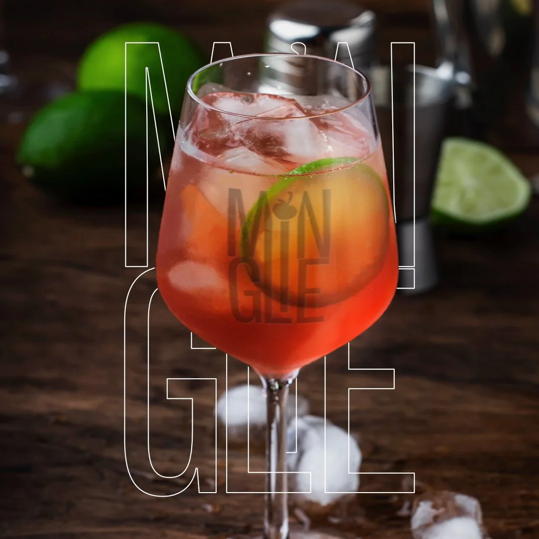
The type face is modern and trendy featuring a cherry on the top of the "I" symbolising a cherry which would be placed through a cocktail stick on some cocktails! Similarly, the M and N have been cut to fit this in which also come together to create a "V" shape resembling the top of a cocktail glass.
The Menu I designed for Mingle features the primary logo as well as some typography and illustrative features used throughout the brand identity such as outlined versions of the logo, secondary word mark in a custom brush style and the cherry icon.


