the purpose
The aim of this project was to give my clients brand a refresh and better creative direction - a solid foundation for them to build upon, whilst maintaining a similar feel to their previous brand assets.
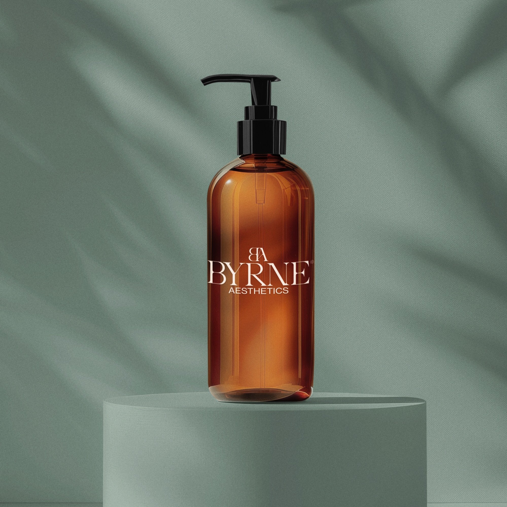
I achieved this by designing a logo with a similar feel as previous but with a more slick and polished appearance as well as versatility with multiple choices on how to portray the brand: Wordmark, Symbol and grid formats.
To go along with this logo refresh, I also chose a colour palette perfectly suited to pair with the new brand which works flawlessly with one an other. This colour scheme can eventually be carried through in to website design and print marketing materials.
All in all - Byrne wanted to show themselves as an aesthetics company who are serious and trustworthy in the industry and by having this cohesive, modern and clean brand identity with a fresh splash of colour, gives off this feeling entirely!


